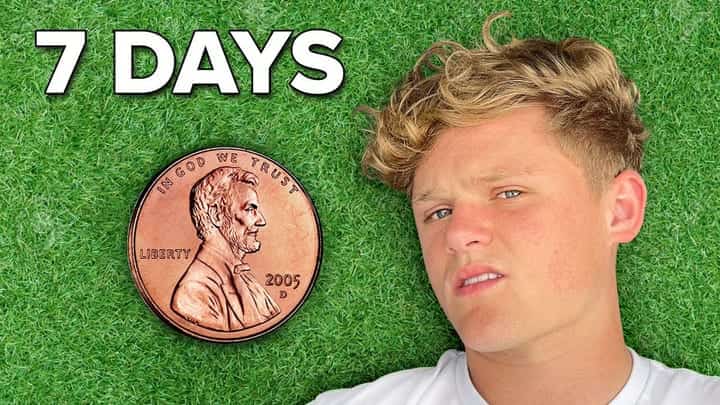
YouTube Thumbnail Design Principles: Complete 2026 Guide
Master contrast, curiosity, faces, text scale, and niche norms for YouTube thumbnails in 2026 — with mobile feed context, specs, and how to score packaging before publish.
Read time: 15 min read
Who this is for: Creators building a reusable thumbnail system — beginners through experienced uploaders whose CTR swings without a clear reason.
The short answer: Design for the smallest tile in Suggested: one focal point, high contrast, few words, face or symbol with emotion, and a promise aligned with your title. Score tentpoles before publish when stakes are high.
Feature comparison
How the features in this guide show up when you score packaging before publish.
| Feature | Typical workflow | With Thumbalyze |
|---|---|---|
| Contrast & focal point checks | Eye test | Scored dimensions |
| Curiosity vs clickbait balance | Guesswork | Curiosity + titles |
| Face / gaze hierarchy | Manual crop | Heatmap + Coach |
| Type readability at tile size | Zoomed canvas | Feed preview |
| Publish confidence | Hope & CTR later | Score before upload |
Thumbnail design is not graphic design in a vacuum. It is packaging for a competitive feed where viewers decide in a fraction of a second while scrolling on a phone. The image you loved on a twenty-seven-inch monitor is not the same image YouTube shows beside nine saturated competitors on a six-inch tile. The principles that matter in 2026 are the ones that survive that shrink: separation and contrast, a single focal point, hook text at readable scale, honest emotion, and a visual promise that matches the title. When any of those fail, production quality does not matter — the click never happens. This guide assembles those ideas into a practical rubric you can use in Canva, CapCut, Photoshop, or AI pipelines. Where it helps, we reference Thumbalyze’s six-dimension CTR analyzer, gaze heatmap, feed preview, title suggestions, AI look check, variant generation, and Coach — so principles become checklists and revisions instead of vague arguments.
Why thumbnails are packaging, not decoration
A thumbnail’s job is to earn the click that starts watch time. Decoration optimizes for looking good in a folder on your desktop. Packaging optimizes for beating neighbors on the grid while viewers scroll with their thumb already moving.
That distinction changes how you evaluate drafts. Pretty color harmony that you notice in a lightbox is irrelevant if the subject disappears into a mid-tone background at phone scale. Packaging design always asks the competitive question: would I tap this before the tile to the left?
Every principle in this guide assumes mobile-first viewing and Suggested-style density. If a design fails the squint test at arm’s length on your phone, it will fail in the wild no matter how sharp the export resolution is.
- Optimize for the tap, not the portfolio.
- Judge on gray backgrounds, not white artboards.
- Treat every upload as a race against neighbors.
Contrast and luminance separation
Subject and background must separate instantly. Mid-tone cinematic grades look rich full screen and mush together as a tile. Viewers do not analyze your LUT — they pattern-match bright faces and high-contrast shapes.
Reliable fixes include rim light, subtle outline, complementary color pairs, and deliberate background simplification. Lift faces above background luminance even when the video itself is moody — packaging can be slightly more aggressive than in-video color without lying about content.
Run the squint test on every export: blur your eyes until details go soft. You should still find the face or primary object immediately. If everything collapses into one blob, contrast is the first variable to fix before you touch fonts or expressions.
Dark mode feeds punish crushed shadows. OLED displays clip detail differently than studio monitors. Preview on both light and dark UI when your niche skews mobile.
- Avoid grey-on-grey trend grades on small tiles.
- Use one dominant subject value against a simpler ground.
- Check contrast again after JPG compression — banding hides edges.
Curiosity without clickbait fractures
Curiosity is the gap between what the viewer knows and what they want to know. Strong packaging shows stakes and withholds payoff that the video actually delivers. Weak packaging fakes shock — high CTR, crashing retention, algorithm distrust.
Honest curiosity uses props, partial reveals, juxtaposition, and reaction faces tied to real moments in the edit. The thumbnail should be the first frame of a truthful story, not a different movie that only exists on the grid.
Ask whether the first thirty seconds of the video repay the promise made by the image. If not, revise story or packaging together — not one in isolation.
Thumbalyze’s curiosity dimension and title suggestions can flag when an image overshoots or undershoots relative to the title. Use them as alignment checks, not creativity replacements.
- Show enough to promise; hide the payoff for the video.
- Avoid red circles, arrows, and shock faces you cannot justify.
- Pair curiosity tweaks with retention review in Studio.
Faces, emotion, and gaze direction
Human faces with readable emotion still outperform neutral stills in many niches because they signal stakes instantly. Micro-expression matters at thumbnail scale: exaggerate slightly compared to in-video subtlety while staying believable.
Gaze guides attention. Eyes looking toward hook text or a prop create visual paths that show up in gaze heatmaps. Random off-camera stares waste hierarchy unless the mood is the message.
Faceless channels can win with a single bold object, diagram, or UI crop if hierarchy rules are strict: one hero element, one hook phrase, extreme contrast. The face rule becomes a focal-point rule.
When scoring in Thumbalyze, compare heatmap hotspots to what you intended viewers to see first. If attention pools on background detail, crop, blur, or relight before you add more text.
- Prefer open eyes and visible emotion over generic smiles.
- Keep faces large enough to read expression at squint scale.
- Block text from covering the emotional center of the face.
Typography at thumbnail scale
Hook text should typically land at three to five words. Strokes, shadows, and plate shapes exist for readability, not decoration. If you need a full sentence on the image, the real hook probably belongs in the title instead.
Thin weights, cramped tracking, and low-contrast fills disappear in browse. Use heavy weights, generous spacing, and colors that separate from both background and skin tones.
One primary text block beats two competing headlines. Secondary labels distract unless your niche uses them as a deliberate pattern interrupt viewers already understand.
After adding type, run another squint pass — type is the first element that fails when creators design zoomed in on canvas.
- Keep safe margins; crops clip edges on some placements.
- Match title promise — do not tell a different story.
- Avoid all-caps paragraphs longer than two short words.
Niche norms and pattern interrupts
Each niche has visual dialects: finance tends toward trust and clarity, gaming toward saturation and energy, education toward clean type and diagrams. Learn the top ten patterns in your sub-niche before you improvise.
Pattern interrupts work when they preserve trust cues your audience expects. Random neon in a sober niche reads as spam. Sudden minimalism in a hype niche reads as low effort.
Document wins and losses in a simple swipe file — not to copy competitors, but to learn which interrupts actually moved CTR on topics similar to yours.
When you break a pattern, break one variable at a time: color, layout, or expression — not all three — so post-mortems stay legible.
- Study competitors in Suggested, not only homepage heroes.
- Align interrupts with title stakes, not mood alone.
- Refresh patterns when your grid starts to look samey.
Technical spec discipline
YouTube’s published thumbnail guidance still applies regardless of design tool: 16:9 aspect ratio, recommended 3840×2160 resolution, minimum width 640 pixels, JPG or PNG formats. GIF and BMP are supported but uncommon for pro workflows.
Mobile upload paths often enforce roughly a 2 MB file size ceiling, while YouTube Studio tolerates much larger uploads — up to about 50 MB on many flows. Export a high-quality master, then compress deliberately for mobile if your team attaches thumbs on phones.
Oversized PNGs from design tools look crisp until compression mangles edges. Undersized sources upscale into mushy type. Start from adequate capture resolution before stylizing.
Thumbalyze’s free size checker at /tools/youtube-thumbnail-size-checker confirms dimensions and weight before upload errors stall a schedule.
- Master at 3840×2160 when possible; avoid vertical crops.
- Prefer JPG for photo-heavy thumbs; PNG when type is delicate.
- Re-check file size after last-minute text edits.
Scoring, heatmaps, and iteration
Principles become habits when you grade tentpole uploads every time. Upload drafts to Thumbalyze for dimensional CTR feedback, gaze heatmap review, and feed preview against generic neighbors — not in isolation on white.
Revise one variable per pass while learning: contrast first, then text scale, then expression or prop. Changing everything at once teaches nothing when CTR moves.
Coach feedback helps solo creators prioritize fixes when scores feel abstract. Ask why a dimension lagged and what single change would lift it most.
Keep before-and-after score notes for series you refresh — packaging evolves slower than UI chrome on YouTube itself.
- Score two finalists before picking a winner by taste.
- Use title suggestions to catch promise drift late in the edit.
- Regenerate variants only after you know which dimension failed.
Putting the rubric on your calendar
Build a three-layer mental template: simple ground, hero subject, minimal hook text. Run the rubric on every upload, but spend extra time on videos with high production cost or sponsor obligations.
Principles are cheap; impressions are expensive. A disciplined twenty-minute packaging block prevents days of wondering why a strong video underperformed on browse.
Share the rubric with editors or thumbnail contractors so critiques reference scores and legibility rules, not vague aesthetic preference.